
The Maryland Connoisseur Method: Decoding the Visual Aesthetic of STRANE’s Electric Hour
- Maryland Connoisseur

- Dec 2, 2025
- 7 min read
In the crowded landscape of cannabis marketing, "Golden Hour" has become a safety blanket. We see it everywhere: the soft, amber light of a setting sun, lens flares dancing across a manicured field, a model laughing in a linen shirt. It communicates warmth, organic wellness, and the gentle end to a busy day. It is safe. It is effective.
But It Is Not For Everyone.

Not every brand lives in the gentle glow of the setting sun. Some brands are nocturnal. They thrive in the neon-soaked energy of 3 a.m. They demand voltage, saturated colors, and an attitude that is unapologetically loud. They don't want to blend in; they want to break the lens.
This was the driving force behind the "Electric Hour" test shoot for STRANE.
"The Electric Hour isn’t about the sun going down. It’s about the amps turning up. It’s the light of neon signs reflecting off wet pavement and the strobe of a basement show."
Using the Maryland Connoisseur Method, we set out to prove that our virtual photography workflow isn't just for creating soft, aspirational lifestyle imagery. It is a powerful engine for visualizing specific, high-intensity brand aesthetics.
This is a deep dive into the creative process of decoding two iconic mylar bags and translating them into a living, breathing digital world.

Decoding the Brand DNA: It Starts with the Bag
The most critical step in the Maryland Connoisseur Method occurs long before the camera shutter clicks or the rendering engine fires up. It is brand analysis.
In a regulated market like Maryland, the packaging is often the only physical touchpoint a customer has with the brand before purchase. It is the billboard, the handshake, and the promise all rolled into one.
Before a single pixel was crafted, we had to "read" the packaging to figure out the rules of the visual world we were building.
Strane’s branding is distinct, aggressive, and highly recognizable. It doesn't rely on the clinical minimalism that dominates the medical side of the industry. It features a gritty, yellow brick-wall texture, "sticker-slap" typography, and high-contrast color palettes. It feels like the back wall of a dive bar venue, layered with years of band posters and graffiti.
It Feels Like Street-Art.
To figure out the aesthetics for this shoot, we treated the packaging as the script. We asked ourselves: If this bag were a room, what would it smell like? What music is playing?
The Texture: The "brick wall" graphic on the bag dictated the environment. A clean, white wall or a sterile kitchen counter would be a betrayal of the brand's identity. We needed grunge. We needed concrete. We needed an environment that felt like the physical manifestation of that label—somewhere slightly underground, worn in, and authentic.
The Palette: The colors on the bag became our lighting gel codes. We decided early on that we wouldn't use white light. We weren't just lighting the subject; we were painting the air to match the strain profile.
The Visual Process: Constructing the "Electric Hour"
Once we understood the brand's DNA, we had to translate it into a visual language. We coined this aesthetic the "Electric Hour." Unlike natural light, the Electric Hour is artificial, curated, and intense. It creates deep shadows and blown-out highlights. It creates drama.
To ensure the visuals were perfectly on-brand, we broke the shoot down into two distinct vignettes, each serving a specific strain profile.
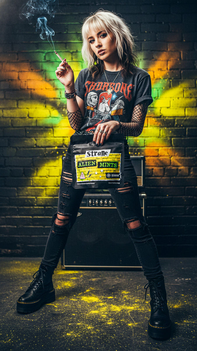
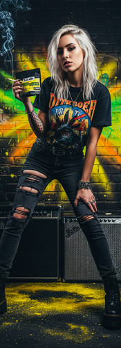
Case Study 1: Alien Mints
The Alien Mints packaging is a visual assault of radioactive acid green vibrating against deep black. It suggests something extraterrestrial, potent, and perhaps a little dangerous. To visualize this, we built a digital vignette that felt "intergalactic" yet grounded in the urban underground.

We utilized hard, directional green light to cut through the darkness, mimicking the glow of a sci-fi abduction beam or a toxic spill in a dark alley. But light needs something to catch it. We introduced heavy volumetric fog—not a soft, romantic mist, but thick, hanging smoke that caught the green light rays.
"We needed the image to feel cerebral and heavy, exactly like the strain itself."
The result is a mood that is eerie and magnetic. The green spills over the model's skin, blending with the shadows to create an image that feels like a scene from a sci-fi noir film.
Case Study 2: Lemon Maraschino
If Alien Mints was the bass line, Lemon Maraschino was the guitar solo. The packaging is a violent, joyful clash of hot magenta pink and intense sunshine yellow. It screams flavor, citrus, and kinetic energy.
For these visuals, we used a "split-tone" technique.
We blasted the background with hot pink gels while hitting the virtual models with a warmer, yellow rim light. In color theory, these colors vibrate against each other, creating a sense of movement even in a static image.

The energy here is distinctly different from the Alien Mints setup. It is brighter, sharper, and more chaotic, perfectly capturing the "Sativa-leaning" buzz often associated with bright citrus profiles.
It’s pop-punk energy visualized!
Styling the Narrative: Punk Rock & Polarity
Visualizing the brand goes beyond just lights and background; it requires the right "actors" on the stage.
You cannot place a model in yoga pants and a cardigan into a Strane advertisement; the cognitive dissonance would kill the vibe.
Because the STRANE brand feels like a sticker on a guitar case, the styling had to match. We leaned into a heavy Punk/Grunge aesthetic.
Wardrobe: We styled the virtual models in leather jackets, distressed denim, vintage band tees, and fishnets. This wasn't a random fashion choice; it was a direct reflection of the "street" texture found on the Strane mylar bags. The leather reflects the hard lights, adding another layer of texture to the image.
Hair & Makeup: We used the models' hair as an extension of the color palette—neon green streaks for Alien Mints, pink bobs for Lemon Maraschino.

"The models look like they belong in the room, and the room looks like it belongs inside the bag. That is the definition of visual cohesion."
The Maryland Connoisseur Method: Real Glass, Virtual Worlds
This project highlights the true power—and the "secret sauce"—of the Maryland Connoisseur Method. It is the seamless fusion of the real and the surreal.
Many virtual productions fail because they try to digitally render the product. No matter how good the software is, a 3D render of a mylar bag often looks like a video game asset. It lacks the tactile crinkles, the specific way light hits the foil, and the organic imperfection of reality.

We didn't render the bags. We used high-fidelity, studio-lit macro photography of the actual Strane product. We photographed the bags and the flower in our Baltimore studio using the exact lighting angles we planned for the virtual world.
We then composited these real assets into our curated virtual environments. This ensures that the texture of the flower and the sheen of the mylar are 100% authentic, while the world around them is limited only by our imagination. It grounds the fantasy in reality.
Let's be clear: virtual production is not here to replace the magic of a traditional on-location shoot. There is no substitute for the raw energy of a real set, the chemistry between a photographer and a model, or the authentic texture of a physical location. Brands still need those flagship "Hero" campaigns to define their core identity. Instead, the Maryland Connoisseur Method acts as a strategic force multiplier, designed to fill the content gaps between major productions rather than eliminate them.
The Business Case: Rapid Prototyping for Brands
Why does this matter for a Multi-State Operator (MSO)?
The "Electric Hour" was a proof of concept—a way to test a radical creative direction without the risk of a physical production. To shoot this concept physically, a brand would need to rent a gritty warehouse location, hire art directors to graffiti the walls, rent expensive lighting packages, and cast specific alternative models. If the final images didn't resonate with the demographic, that creates a $20,000+ loss.

With the Maryland Connoisseur Method, we can "rapid prototype" the aesthetic. We can show the client exactly what a "Grunge/Punk" direction looks like versus a "Cyberpunk" direction, all before a single physical set is built.
Conclusion: Visualizing the Vibe Before You Shoot
The future of commercial cannabis photography isn't just about higher megapixel counts or sharper lenses. It is about emotional intelligence.
It is about looking at a package of Alien Mints and understanding that it doesn't belong in a sunny meadow.

By deeply analyzing the visual cues on the packaging—the texture, the colors, the typography—and building a world that amplifies them, we successfully visualized the raw intensity of the Strane brand. We moved beyond "taking a picture" and succeeded in "building a world."


Whether it is the Golden Hour or the Electric Hour, the mission remains the same: Figure out the brand's soul, and then give it a place to live.


Comments